Sunday, December 01, 2013

Which Casual Gameplay Mechanics are Good for Building Narratives

I was recently playing some computer pinball. I've always been fascinated with the narrative aspects of computer pinball. From when I saw my first pictures of Devil's Crush, I was captivated by the idea that you could have a pinball game with enemies that you could fight by playing pinball. I imagined that game designers could build whole war games and strategy games that you could control by playing pinball.


Anyway, I actually don't ever play pinball in real-life, but it was interesting to see how Pinball FX2 builds missions and progression inside its pinball games. That got me thinking about what sort of casual gameplay mechanics lend themselves to having narratives built on top of them?


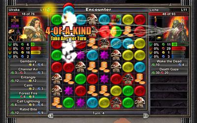
For the last few years, there's been several games that have built narratives on top of match-three games. In games like Puzzle Quest or 10000000, you have a generally linear plot, and you control action by creating matches. Making matches of different colours results in different types of attacks or defenses. There are also RPG elements where you can upgrade to gain new powers and abilities. The problem is that the action of the match-3 game is tightly bound to the action of the narrative. The gameplay doesn't lend itself to letting the player make "choices" in the narrative, so choices must be made outside of the gameplay mechanic.


One of the cool things with pinball is that your actions *indirectly* affect the flow of the narrative. The story can involve quite deep stories and exciting interactions that you can influence with a limited number of levers (unlike match-3 where you have shallow scenarios that you directly control through your matches). You can have exciting scenarios that would be too complicated to build a casual game around (like controlling the events of a war, building an economy, controlling complicated machinery, being an archaeologist), abstract the mechanics so that a player can control these scenarios with simple gameplay levers (to the point that it's so simple that it would be boring if the player were given direct control of those levers), and let the player adjust these levers through the gameplay mechanic (thus keeping things interesting). Also you have choices in that the ramps and targets that you aim for allow you to choose different paths in the narrative. For example, in a pinball game, you can have a story where the protagonist needs to gather five hidden gems and combine them to defeat a boss. The player can control the locations to be searched by targeting different areas with their ball. That sort of plot can be represented as a pinball game.

The main problem with pinball though is that regular unskilled players don't have enough talent to carefully aim their balls, so the game ends up being mostly random. If you don't have enough control over the aim, then you can't really control the flow of the narrative. It might be possible to build a random narrative. For example, you could build a giant map that you can play pinball on (like in Snowball). Even though unskilled players won't be able to control where on the map that they go, the map can be used to represent a protagonist questing through life or through a real map.


But that got me thinking about whether there are casual gameplay mechanics that would be even better for building narratives on. Ones that provide more control, offer interesting narrative possibilities, yet are interesting to play in themselves.

A good game narrative for interactive games lets the player make choices. But we don't want the player to make choices directly. Choice can be represented as "aiming." Could a narrative game be built around Puzzle Bobble? Worms or Scorched Earth? Breakout? Marble Madness? Pachinko? Minigolf? Or maybe the pinball mechanics could be made even more casual? Instead of flippers, maybe you directly send out pulses or something to more directly influence the movement of the ball?


These games focus on a single ball, meaning they're great for narratives with a single protagonist who quests around. But what about a more complex tale? Is there a casual gameplay mechanic that lends itself to resource allocation? If so, you could build RPGs or simulations by letting players assign values to different resources somehow. You could build a game of civilization where you assign your populace to do research or wage war or grow food. Pachinko might work, but it's a bit too random and too slow. Puzzle Bobble? Peggle? Is there a game mechanic that is time constrained and that can become more difficult over time?

Anyway, I think there should be a way to build some more interesting narrative casual games if someone were to put enough thought into this topic.

Tuesday, September 17, 2013

Gradients 5: Refinement of the Precomputed Gradient

One issue with the precomputed gradient was that the triangle mesh was too coarse to capture the details of the gradient. To solve this problem, I progressively refine the triangle mesh until it is detailed enough to show the gradient in the detail that I want. What I do is I first find all the edges of the triangle mesh. I then go over them and look for one that can be split, which creates a new vertex, which can be assigned a new colour, improving the detail in the gradient. When scanning over the edges, I arbitrarily go over them in order from longest edge to shortest edge. I was hoping that doing it that way would help prevent the creation of "skinny" triangles, but in pratice it didn't seem to help too much. For each edge, I split the edge, recompute the gradient, and then compare the new gradient with the old gradient at the vertex points. If the colours of the vertices change by above a certain amount, I keep the split. Otherwise, I revert the split. Then, I move on to the next edge and continue the process until I can't find any edges worth splitting.

Below, I have the triangle mesh generated when splitting an edge doesn't result in any colours changes above 0.1 in any one component (where colours range from 0 to 1).


And here is a triangle mesh when I only split edges that result in a colour change above 0.05. Because I never split exterior edges, there tend to be very long and skinny triangles along the exterior. I guess it would make sense to develop some sort of heuristic to figure out when it makes sense to make a split there.


And if we remove the triangle mesh and just look at the resulting gradient, here is the final result:


The result isn't too bad. The gradient is clearly there, but the colour transitions aren't completely smooth (due to the triangulation). The effect of gouraud shading between edges of the triangle are also visible. The white of the center vertex seems to extend deeper into the polygon that it really should.

But if you compare the generated gradient with that calculated by diffusion or by pure mean value coordinates, the results are decently. Below, the precomputed gradient is in the middle. The diffusion gradient is on the left. The mean value coordinates gradient is on the right.


One of the main reasons for not using mean value coordinates directly in the gradient was that for concave polygons, it could produce illegal colour values that aren't in the range of colours specified along the border of the gradient. As we can from the concave polygon below, we don't encounter any illegal colour values like when using pure mean value coordinates.

Although we still mean value coordinates, because of the way we set them up, it shouldn't be possible to get illegal values. Suppose we have an interior vertex that we're computing mean value coordinates for. Since the vertices adjacent to each interior vertex can all be arranged in a nice clockwise order, the interior vertex ends up with a nice mix of the adjacent colours with all the weights positive and adding to one. So the interior vertex can't have a colour outside the colour ranges of the vertices it is adjacent to. As such you shouldn't be able to get any colour values for an interior vertex that is outside the range of colours assigned to the boundary of the polygon. The problem with mean value coordinates on a concave polygon is that the vertices sometimes run clockwise or anti-clockwise, resulting in negative weights, which can result in the illegal values.


So that's my gradient. The resulting precomputed gradient can be rendered quickly on graphics hardware and has all the nice properties we want from a gradient. The only issue is that it's still a little slow to compute. It would be better if there were a better policy that could be used to create the triangulation of the polygon and its refinement. If I were better at the math, it might be cool trying to develop some sort of process for the diffusion or generating the weights that would result in only local changes to vertex colours when an edge is split, but I'm not sure if that's actually feasible (but it would make the mesh refinement process much faster!).

Wednesday, September 11, 2013

Gradients 4: Precomputing Mean Value Coordinates and Diffusion

Although I have already shown two really good techniques for calculating gradients using diffusion or mean value coordinates, they don't quite do everything that I want them to do. One of the main benefits of vector drawings over raster drawings is that they are easier to animate, but mean value coordinates and diffusion aren't fast enough for real-time animation. Graphics hardware is optimized for displaying triangles on the screen, so the ideal gradient algorithm would be able to break down a gradient shaded polygon into a set of triangles that can be blasted to the screen quickly by the graphics hardware. We can use techniques similar to 3d animation where the animated geometry is precomputed: we'll try to break down the gradient polygons into triangles in advance, and those triangles can then be animated easily. This does mean that the gradients can't change during an animation, but hopefully allowing the geometry to change during an animation provides sufficient flexibility for artistic expression.

Precomputing a diffusion gradient is a little messy since it relies on a pixel grid instead of the triangles that we want in our final output. If I paid more attention in my classes on calculus and numerical methods, I might be able to rederive the diffusion equations for use on a triangle mesh instead of on a grid, but that's really beyond my mathematical ability at the moment. On the other hand, applying mean value coordinates to a triangle mesh is straight-forward, but mean value coordinates can potentially produce bad values when used on concave polygons. Instead, I've tried to combine both approaches. I'm precomputing a diffusion gradient by using the mean value coordinates as the basis for diffusing values through a triangle mesh. Basically, instead of finessing the problem, I'm going to bash this problem with a brute force hammer until I get something that seems to work. It may have no proper mathematical basis, but it should hopefully produce something good enough for real use.

The first step is to create a triangle mesh over which I can diffuse a gradient. The scientific computation community has all sorts of techniques for computing triangle meshes that are optimal for doing various things, but I don't know any of that work, so I'm just going to put together something hacky. The first step is to use some sort of bog standard polygon triangulation algorithm to create an initial triangulation.


The edges in a minimal triangulation of a polygon always go between corner points of the polygon (i.e. no new points or interior points are necessary). Since these points already have colours, we can build a gradient using barycentric coordinates for the triangles in the triangulation. The resulting overall gradient for the polygon has the correct colours along the exterior edges of the polygon but looks inconsistent and odd in its interior.

Since the main primitive in graphics hardware are triangles shaded using barycentric coordinates, if we want a different colouring at the interior of the polygon, we're going to have to add some new points to the interior of the polygon and change the triangulation. As a heuristic, I generate these new points in this way: I find triangle edges that join points that aren't adjacent in the original polygon, and I split that edge. This gives me extra point that I can use to control the colouring at the interior of a polygon.


From there, I calculate new colours for all the interior vertices I've created inside the polygon. I do this by diffusing colours inwards from the boundary of the polygon: I iterate over all the interior vertices, and I set the colour of each vertex by mixing together the colours of adjacent vertices using the ratio given by the mean value coordinates, and I keep doing that until I reach convergence. In actuality, the mean value coordinates of all the interior vertices actually form a linear system of equations that should be small enough to solve so that might be a better way of computing the final gradient than iteratively diffusing colours through the mesh (in fact, I'm not sure diffusing colours with mean value coordinates will actually converge to the correct values). But I already had code for diffusion but I didn't have code for solving a linear system of equations, so I went with the diffusion route.


If we remove the triangle mesh, we arrive at the final result.


The result is similar to the gradient created by diffusing colours, but it still needs more refinement. The area around the white vertex in the middle of the polygon has too much white because the triangles mesh is too coarse there.

Friday, September 06, 2013

Gradients 3: Mean Value Coordinates

Although building gradients through diffusion produces nice results, the actual computation of these gradients is slow and cumbersome. Ideally, we want something like triangle barycentric coordinates but for arbitrary polygons: we want a nice simple equation that can be computed at arbitrary points inside a polygon that provides a nice gradient for us.

Fortunately, such an equation exists. It is called Mean Value Coordinates, and it was constructed/discovered by Michael Floater a few years ago. If you want to calculate the colour of any point in a polygon, you just take the colours of all the corners of the polygon, feed them into the equation described in the paper, and it will tell you how to mix the colours together to get the final result. The equation generates nice smooth gradients with practically all the properties you could want from a gradient such as linear transitions of colours along edges etc. What this means is that instead of having to iterate over the pixels of a polygon repeatedly to diffuse colours over it, you can just compute the gradient in a single pass over the pixels. Below is a picture of how a gradient computed using Mean Value Coordinates looks like. Notice that it is almost identical to the gradient produced using diffusion.


Mean value coordinates seem like the perfect solution for solving all gradient problems. In most cases, they are, but there are still a few tiny issues. One is that the gradients are supposedly not bilinear for rectangles. This means that if you map an image onto a rectangle using mean value coordinates, the image will be warped and won't perfectly reproduce the original image. Although this may be true, my tests with mean value coordinates seemed to indicate that this effect is hardly noticeable.


Another problems arises with concave polygons. When dealing with concave polygons, the colours of the gradients might not stay within the range of colours given to the corners of the polygon. In the image below, a gradient is constructed over a polygon where all the corners of the polygon have a grey value of 0.1 except for the two middle points, which are assigned a white value of 1.0. Although the gradient looks quite nice, some parts of the polygon end up being coloured with grey values less than 0.1. In the right image, pixels with grey values less than 0.09 are coloured in red, showing the region where the gradient is outside the range of colours given at the corners. This is worrisome. For concave polygons, the gradient might contain illegal colour values (like colour values less than zero). This effect also prevents you from creating a gradient of texture coordinates because the coordinates might be mapped outside the range of the texture.


Lastly, although mean value coordinates are much faster than diffusion, you still can't use them directly in real-time animation because they are too slow. Calculating mean value coordinates for a pixel requires merging in all the colours of a polygon's corner points, but there could potentially be a lot of points, especially when trying to recreate a curve using polygons. Trying to do these calculations in graphics hardware would be difficult for polygons with large numbers of points. So some sort of precomputation is needed to use mean value coordinates in an animation.

Sunday, September 01, 2013

Gradients 2: Diffusion

The main way of understanding gradients mathematically, is to view them as a 3d surface or 3d patch. The surface is bounded by the 2d shape you are filling, and the height of the surface corresponds to the colour of the gradient. So for a black and white image, the height of the surface function would refer to the grey-level of the gradient. For an RGB colour image, you might have three different surface functions for each of the red, green, and blue values of the gradient.

Finding a gradient then comes down to finding an appropriate surface function or height map that matches the properties that you want for the gradient. This is why many 2d vector drawing programs include support for gradient meshes. The gradient meshes map directly onto well-known mathematical shapes such as coons patches or bezier patches that can be used as a surface for the gradient. Unfortunately, when trying to build a gradient for an arbitrary polygon, gradient meshes are sometimes cumbersome to use because they might not fit into the shape of an arbitrary polygon and they have many control points that need to be adjusted to get the desired effect.


In the last few years, there has been a lot of talk of using diffusion curves for drawing images with lots of smooth shading. Diffusion curves can form a suitable basis for drawing gradients in arbitrary polygons. The main algorithm for actually determining the height map of the surface that forms the gradient is described in Sketch based coding of grey level images. The basic idea is that you specify that certain points have to be certain colours, and the algorithm then tries to interpolate the colours between the points. Since you want the shading to be "smooth," the algorithm should try to minimize how quickly the colour changes across the surface. Since this is a surface, the change in colour at any point can be expressed as ∂f/∂x and ∂f/∂y. Since you want to minimize the change in colour across the whole surface, you should integrate those changes over the surface and minimize that value: ∬(∂f/∂x)² + (∂f/∂y)². If you want to minimize that value, you just have to take the derivative, set it to zero, and try to solve. Solving it requires the use of discrete calculus, the Laplacian, and various numerical techniques.

It all sounds messy, but you can actually skip over all the math and jump right to the punchline. In the final algorithm, all you have to do is, first, set colours for certain points in your image that you want be fixed. Then you repeatedly go over the image, and for each pixel, you set it to the average value of the adjacent pixels. If you keep doing this, colours will eventually diffuse throughout the image, and you will get your gradient.

Below is a gradient I created for a concave polygon with different colours at each point:


Although the gradient is very smooth, the diffusion is too uncontrolled. For example, the colour from the white point at the center of the polygon diffuses to many of the edges of the polygons. This is problematic because it means that the colours along the edges of the polygon are dependent on colours used throughout the polygon. This makes it hard for users to create two polygons beside each other with the same colour along their edges.


The diffusion curves paper solves this by strictly defining what the colours along the edges of the polygon should be. Along the edge of the polygon, the colours should be a linear mix of the colours at the points on each end of the edge. So when doing the diffusion, not only do we set the colours along the ponts of the polygon but along the edges as well. Below is a picture of the result. Notice that the white colour of the point in the middle no longer influences the colours of polygon edges that it isn't adjacent to.


So that's how you can build gradients using diffusion. The main problem with this technique though is that it's slow. Diffusing colours throughout an image until you reach convergence can take a lot of iterations. You can use multigrid techniques to get reasonable speed, which basically means you start with a very low resolution image, and slowly up the resolution as you diffuse your colours. Unfortunately, it's still too slow for real-time graphics like what you would want in a game, for example.

Sunday, July 21, 2013

The Gender Politics of 1+1=2

Last weekend, I tried making a little romance game for a game jam. Surprisingly, the hardest part in the design was avoiding all sorts of gender politics minefields that I didn't realize were there. I guess there are so few games centered around romances, that I didn't understand that it's really easy to make an insensitive romance model. There are so many games centered on violence that the minefields in those games are well known: make sure your game isn't exclusively about white people killing non-white people and throw in a token mix of genders and you're generally pretty safe. With romance games, these sorts of politics haven't been worked out yet.

Terminology
Even figuring out something as basic as terminology was really difficult. I wanted to make a regency romance game, with Darcys and Elizabeth Bennets, who you are trying to get married. So the two types of characters in the romance simulation would most easily be named men and women. Of course, a computer simulation doesn't really care about genders, and given my proximity to San Francisco, there's no reason that my simulation shouldn't support the option of men-men, women-women, men-women, women-men, ?-? pairings. But what terms should I use for the two types of characters then? One way to get around this problem would be to only have one type of character, but I was making a tower defence game where the "attacking" characters are distinct from the "defence" characters. I decided to call the "attacking" characters suitors. But what would an appropriate term for the "defence" characters be? After much digging online, I couldn't find anything good. Terms like defendant, target, or wooed just seemed too adversarial or awkward. It's weird that I couldn't find a nice simple term to express the object of one's affections. Finally, after an hour of searching, I just gave up and decided to move on.

Romance Statistics
Since I was building a tower defence romance, the romances needed to be represented numerically so they could be simulated instead of using a hand-crafted narrative that might be possible in a work of interactive fiction. Now in a traditional tower defence, the units have various stats like hit points, attack power, defence power, etc. But what are appropriate stats for a romance? Some stats like social station or income level are considered politically incorrect today, but they can be included in an ironic sort of way. But if you look at a novel like Jane Eyre, beauty and looks do influence romances, so that should be modeled in the simulation somehow. But is it really politically correct to have a game that gives advantages to the good-looking in romances? On the other hand, people would object if someone made a Jane Eyre game where she were depicted as beautiful instead of as plain. After much brainstorming, I figured out that I could use "fashion" as a statistic instead of "looks." Although fashion can be used to model the difference between a plain Jane Eyre and a handsome Emma Woodhouse, it's considered palatable to modern sensibilities because "fashion" is something that can potentially be changed whereas "looks" are considered as more innate.

Romance Model: 1+1=2
After coming up with a few basic stats for the characters in the game, I then had to come up with a model for how romances would work in the simulation. In real-life, romances are quite complicated. Since my tower defence game was intended as a silly little casual game, I wanted to find as simple a romance model as possible.

So suppose you have two characters attending a music concert.
Character A has a music rating of 5.
Character B has a music rating of 3.
How much should the love between A and B increase during the concert?

A*B: Initially, I was thinking of multiplying the two numbers together. The most obvious interpretation of this romance model is that A's interest in music is 5/5, and B's music ability is 3/5. Multiplying 5/5 by 3/5 gives you the amount that B's music ability is able to satisfy A's interest in music. Although the math is symmetric, the interpretation is not. It seems like B exists solely to satisfy the interests of A. I didn't want people to come away with the idea that the "wooed" existed solely to catch the interests of the "suitors."

A+B: Adding the numbers does result in a stretched, but plausible interpretation that's also symmetric. Love between the two characters increases by A+B because their enjoyment of the music concert is dictated by their combined backgrounds in music. By sharing this enjoyable experience, their love for each other increases. The problem with this model is that it results in weird characters statistics as the game progresses. As players get deeper into the game, the game should get harder. You want to make it harder for characters to fall in love as the game progresses to increase the challenge. Characters fall in love slower if their stats are lower. So as players go deeper into the game, they will end up encountering lamer and lamer characters, which doesn't seem right. The characters should get more interesting and have higher statistics as the game progresses not have lower statistics and become less interesting.

-abs(A-B): Taking the negative delta of the two numbers results in a symmetric interpretation that doesn't require characters in later levels to have lower statistics. The interpretation of this approach is that two people who share a similar interest and background in music will fall in love. People who have a disparity in their interests will not. This works, but I was worried that this interpretation might be too complicated for casual gameplayers to understand.

Overall, this whole game ended up being complicated in a way that is more annoying than fun for me. Perhaps my underlying approach to modelling romances in fundamentally wrong. Perhaps I should have gone for a like/dislike model instead like Miss Management. Ugh. Very frustrating.

Friday, July 05, 2013

Gradients 1: The Problem of Gradients

When I learned math and geometry in school, I always got the impression that it was invented by the Greeks hundreds of years old. So when I got to university, I was fascinated by the fact that many mathematical concepts that we were taught in schools were actually fairly recent discoveries. Then, as I studied things even more, I discovered that there are some pretty basic geometry operations that we still don't know how to do. It boggled my mind that researchers were still trying to work out how certain key building blocks of computer graphics should work. One of those areas is gradients.

Gradients sound like they should be simple. How do we shade in a shape? If we assign colours to the different points on a polygon, how do we colour in the inside of that polygon?


For triangles, we can use barycentric coordinates. If we want to colour a point in a triangle, we draw lines from the corners of the triangle to this point. That creates different areas. The ratio of the sizes of these areas gives us the ratio we should mix the colours at the corners. The bigger the area, the more of the colour at the opposite corner should be used. This technique for colouring triangles is so simple and so elegant that modern computer hardware is designed specifically to draw these gradient-shaded triangles.


Just moving to four sided shapes immediately causes problems. You would think that you could simply cut a four-sided shape into two triangles, and then use barycentric coordinates to colour the two triangles. Unfortunately, this leads to inconsistent results. Depending on how you cut a four-sided shape into triangles, you get different colourings. Below, in the center square, the middle of the square is a mix of red and blue with no yellow nor green: a purple. In the square on the right, the middle of the square is a mix of green and yellow with no red nor blue: a light-green.


Once you move to five-sided shapes or shapes with curvy sides, things become even more complicated. Gradients should be a basic building block for 2d graphics, but in most computer programs only support simple gradients like linear gradients where one side of a shape is one colour that smoothly blends to another colour on the other side of the shape. So that is the gradient problem that still needs solving: how do we colour a multi-sided shape with different colours at its corners?

Wednesday, February 20, 2013

Observations about Teaching Programming to Kids

For the past year or so, I've been acting as an assistant at various events that teach programming to kids. As an assistant, I don't actually directly teach anything up front, but stay in the back helping the kids, which allows me to see what material the kids seem to enjoy and understand and what material the kids find boring or complicated. It turns out that teaching programming to kids is tough! There are a lot of complications and constraints that you need to keep in mind when designing a programming for kids. So I'm using this blog post to gather together some of my observations so far.

Setup

  • Programming courses are often taught as "one-off" enrichment opportunities for kids. As a result, you only have 1-2 hours to teach everything that you're going to teach. You can't really teach material that gradually builds up to something advanced and cool. You have one go to teach kids enough to be self-sufficient in some task and you need to inspire them to pursue additional learning on their own.
  • The kids are usually fairly young, definitely pre-highschool. High school kids are usually "too cool" to get dragged off to such events (they'd be scared away by all the younger kids anyway), and are usually mature enough to simply learn programming on their own anyway.
  • Kids are often ok with installing all sorts of weird crap on their computers, so as long as you're there to help with the installation, you can install all sorts of weird IDEs if it helps.
  • On the other hand, some of the kids have really old, crummy computers laden with viruses, so it's better to stick with simple, well-tested things that will work even on old computers. Definitely don't write your own software for such an event because you won't have time to test it on all the weird bizarro configurations that the kids are going to come in with. 10 year old Macintosh, Chromebook, IE5, iPad, Linux-boxen, brand-new ultra-locked down versions of Windows that they don't have the password for, etc.

What to Teach

  • There isn't enough time to learn any advanced concepts, and kids aren't impressed by the inherent "beauty" of certain programming concepts. You need to teach them how to do something concrete that gives them constant feedback on their progress. Teaching things like HTML or graphics works well. 
  • Kids can't draw, so teach them how to use images. Better yet, teach them how to include random images they find on the Internet, then they can really customize things and make their creations more personal to them.
  • Although kids will often find displaying text on the screen boring, kids are easily amazed at stuff that programmers find boring and trivial. Drawing circles, displaying text on the screen, changing the headline on the webpage of a newspaper, putting stuff on the Internet that other people can download. This provides kids with a sense of empowerment. Professional programmers have lost this sense of wonder a long time ago.
  • Kids will have different levels of experience and will progress at different rates. If you only have a single "project," some will finish quickly while others will fall behind. Ideally, you should have an open-ended project where kids who finish early can keep adding their own stuff to their project while other kids are still working through the more basic material. It might also be possible to have a mix of both basic and advanced material in the same course (those who fall behind can skip the advanced material), but I'm not sure how well that would work.
  • Kids are willing to accept things on blind faith and are ok with using stuff they don't understand. They're fine with blindly typing in a magic recipe that makes the computer do interesting things. Most of the things they encounter in life are already like that, so it's ok to them. Cars move around as if by magic, babies are delivered by storks, monsters are under the bed, typing in five lines of incomprehensible math magic makes the computer do something cool. Whatever. Often, you can use this as a short-cut to teach them how to do something cool even if the material is way too advanced for them to understand.
  • Do you know what's even better than displaying some text? Cat pictures. With a teddy bear background. And flashing text. And the images move five pixels to the left when you put your mouse over them. And there's a dinosaur that randomly zips around the screen. And let's have some background music. Awesome. These are kids. They aren't interested in publishing essays on the Internet about saving the environment. They want ninja cat pictures with jetpacks. Give it to them.

How to Teach

  • Teach concepts concretely--don't teach things as abstract concepts. Don't go from abstract to concrete. If possible, try to go concrete to abstract. Get them to type something and see what it does. Then help them generalize the concrete instance to the abstract.
  • It's important to break things down to be as simple as possible. And kids often don't know a lot of math at this age either (don't include math or algebra or decimals or possibly even negative numbers)
  • Try and avoid building advanced material on top of simpler material. Some kids will fall behind on the simpler material and will just be lost for the advanced material.
  • Kids learn by doing, so don't lecture. They'll zone out and get bored. I'm an adult, and even I often zone out and get bored if a lecture goes on too long.
  • Children are pretty trustful of authority, so they'll make an honest attempt to follow along with your lesson regardless of how ill-prepared and incomprehensible you are. So even if you botch things up, it's ok because the kids will blame themselves and not you if they find that they can't understand the material. I'm not sure if this lack of meta-learning might extend to an inability to do self-assessments as well.
  • Kids often don't ask for help if they fall behind. Instead, they'll just sit quietly and fumble along. Along these lines, telling kids to "put their hands up if they're behind or need help" isn't going to work. Many kids would die of embarrassment if they put up their hands. It might be better to ask kids the opposite (put up your hands if you've finished), but I'm not sure if that would be effective either.
  • Be flexible and be observant. Often, the class falls into complete disarray after the first hour is done. There's no need to punish everyone further by plowing ahead. Adapt your material, or if that's not possible, just end it.
  • It's ok to let kids just do their own thing. Kids learn by doing, and if they're happy taking a few things you've taught them and making it their own by using those few small elements to make something meaningful to them, that's great. You've only got an hour or two, there's no need to push them to do harder stuff. Try to adapt your material to what they're doing.
  • Source code is hard to understand (but this is true of adults too). When you show source code, you must SLOWLY go through every single line and statement
  • Many presentations involve the presenter typing up code live on the screen. Doing this helps you slow down and helps kids know where to type things. But the text is usually too small (IDEs often falls apart when you make the text big enough to read from the back of the room), and you still type much faster than a kid can type, so they will usually fall behind.
  • Young kids can't really type. Programming environments like Scratch that have very little typing are great. I can't recommend Scratch enough. It's very consistent and discoverable. If you show kids a few small tricks, and just let them loose, they can usually work their own way into figuring out how to do cool stuff on their own. You only need to intervene every once in a while to show them more advanced tricks they can use or to direct them into building more fruitful things.